|
I like to explore different ways to present data. The goal is to present data in a beautiful but mathematically correct way . |
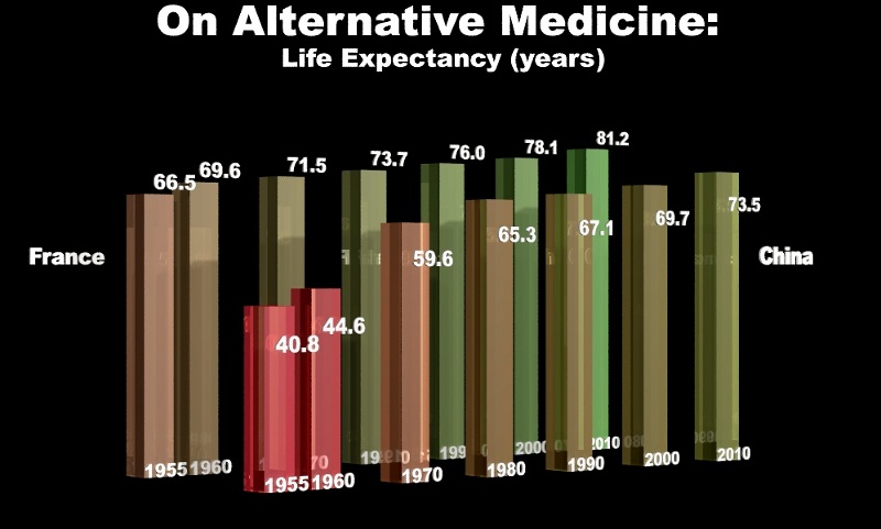
Comparison between life expectancy in China and France.
|
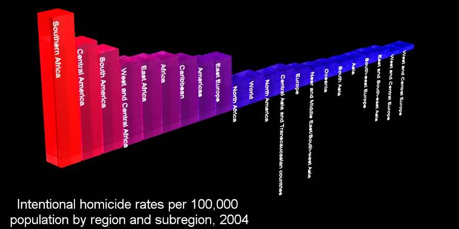
Intentional homicide rates per 100,000 population by region and subregion, 2004
|
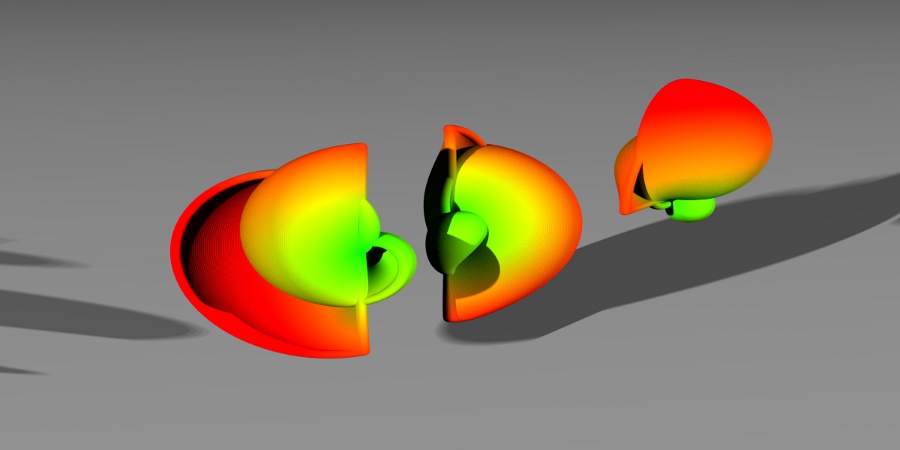
Spherical coordinates function made with spheres. |
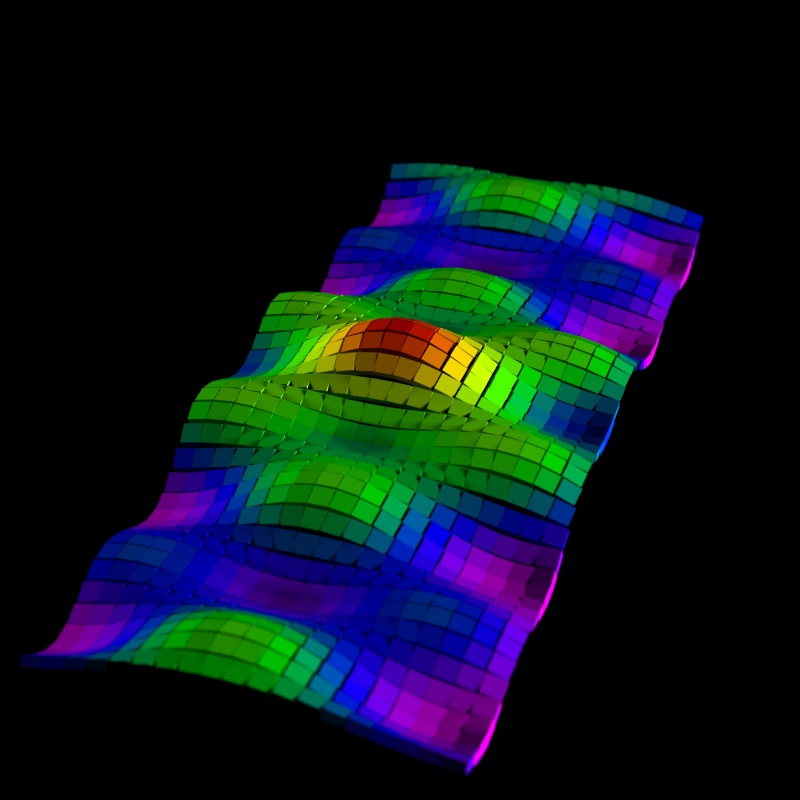
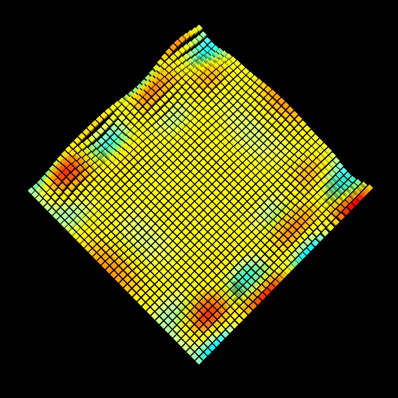
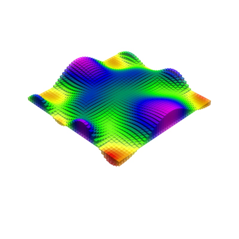
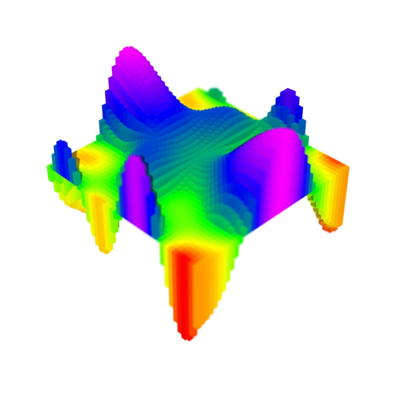
Graph made of cubes. |

Same graph with higher resolution. |
Same graph with higher resolution. |
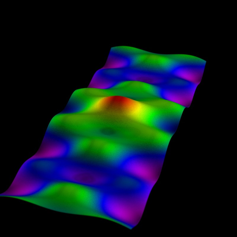
Single Cube 2D surface. |
Single Cube 2D surface. |

Single Cube 2D surface. |

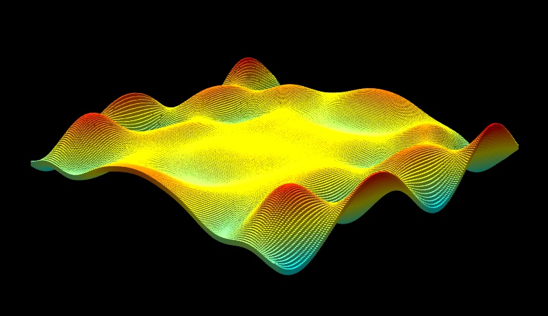
Single Sphere 2D surface. |
Single Sphere 2D surface. |
|
2D Histogram. |

2D Histogram. |
2D Histogram. |
2D Histogram. |
2D Histogram. |

Coloured Arrows. |

3D Coloured Arrows. |